If you’re like most creators, your link-in-bio page is probably working overtime. From subscription platforms and tip jars to socials, merch, new drops, and schedules – there’s a lot going on. But the more links you add, the harder it becomes for your audience to know where to click first. Instead of helping fans connect, your page can accidentally overwhelm or confuse them.
Here’s the good news: organizing multiple links doesn’t mean hiding important stuff – it means making it easier for fans to find exactly what they want, fast. In this guide, we’ll show you how to build a GetMy.Link page that’s clean, strategic, and focused – without sacrificing anything.
Ready to stop drowning in links? Let’s clean up your page and boost your clicks.
Why Less (Links) = More (Clicks)
It might feel counterintuitive, but packing your page with every possible link can actually hurt your performance. When visitors land on a long, cluttered list, they freeze. Too many options = no action. It’s called choice overload, and it’s a real thing.
Instead, think of your GetMy.Link page like a curated menu. Highlight your main offer first – whether that’s a subscription, store, or video drop – then guide fans toward 2-3 other actions. That’s it.Most creators get better results with just 5 to 7 links max on the main view. This keeps your audience focused, reduces distractions, and increases the chance they’ll actually tap.
Pro tip: Ask yourself, “If someone only clicks one thing – what should it be?” That link belongs at the top.
Start With Your Main CTA – and Make It Obvious
Your #1 link – the one you care about most – should be the very first thing people see. Whether that’s “Subscribe on OnlyFans”, “Watch My Latest Video”, or “Shop My Merch”, it needs to be bold, clear, and tap-friendly.
Avoid vague labels like “Click here” or “Link” – instead, use action-driven text like:
- Subscribe on [Platform]
- Watch My Latest Drop
- Shop Official Merch
This tells your fans exactly what they’re getting, and why they should tap.
Group Your Links Into Clear Sections
When everything is stacked in one long list, it’s easy for fans to miss what matters most. That’s why organizing your links into sections with headings makes a huge difference.
Break your page into small, easy-to-scan groups. This helps fans instantly find what they’re looking for – without scrolling forever or guessing where to click.
Here are examples of what you could include – but don’t feel like you need everything! Pick only the sections that actually make sense for you and your audience. A cleaner page = better results.
Subscribe & Support
For your main platforms and tip options:
- Subscribe on OnlyFans
- Unlock Premium on Fansly
- Support Me on Patreon
- Leave a Tip (PayPal, Buy Me a Coffee, etc.)
- Join My VIP Group
Latest Content
Keep fans up to date with what’s new:
- Watch My Newest Clip
- Stream Latest Drop
- New Gallery on ManyVids
- Download Exclusive Files (via GetMy.Link Files block)
- This Week’s Top Video
Follow Me
Your social media profiles in one place:
- X (Twitter)
- TikTok
- Telegram Channel
- Snapchat (if public)
Shop & Merch
Sell products or digital extras:
- Official Merch Store
- Amazon Wishlist
- Buy Custom Videos
- My NFT Collection
Promotions & Giveaways
Highlight time-sensitive offers:
- Free Trial Link (48h)
- Join My Birthday Giveaway
- Holiday Sale -50% Off
Bookings & Events
Let fans book or meet you:
- Book a Custom Video
- 1-on-1 Chat Session
- IRL Event Schedule
- Twitch / YouTube Livestream Times
About Me & FAQs
Share extra context or useful info:
- Who I Am
- My Content Rules (What I Do / Don’t Do)
- How to Contact Me
- Terms & Boundaries
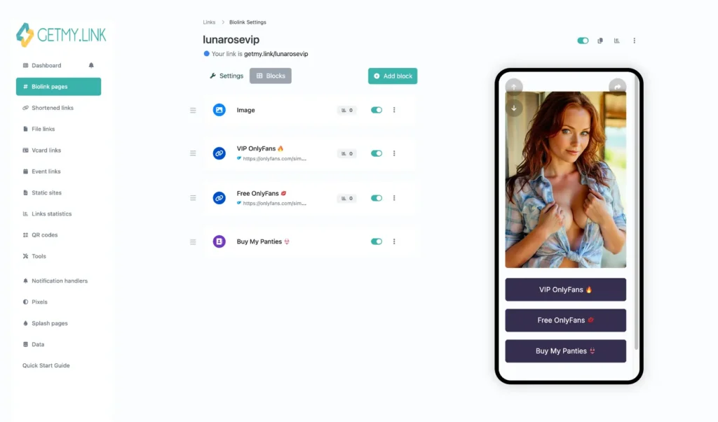
In GetMy.Link, you can use Heading blocks to clearly separate each of these sections. This turns your page into a clean, scannable experience – more like a personal hub than a messy list of buttons.
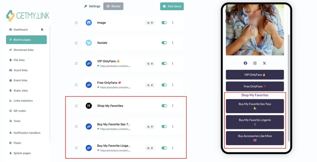
(Screenshot of a GetMy.Link biolink page where affiliate product links are clearly grouped and visually separated from social media icons and OnlyFans pages.)
Use Visual Breathing Room (So Your Page Doesn’t Feel Like a Wall)
Even with great links, your page can still feel overwhelming if everything’s packed too tightly. That’s why spacing, layout, and clean design are just as important as what you’re linking to.
Give your content room to breathe:
- Use white space between sections and buttons
- Avoid stacking 10+ buttons with no break
- Stick to 1-2 main colors to avoid visual overload
- Make sure text is legible on mobile – no tiny fonts!
In GetMy.Link, each block has its own padding by default – but you can make things even cleaner by using Heading blocks to break things up, and Paragraph blocks to add short context if needed. You can also adjust button styles and color contrast so your main CTAs pop visually.
A fan scrolling your page should feel guided – not like they’re scanning a cluttered ad board.
Write Button Text That Gets Tapped
Your button text isn’t just a label – it’s a mini call-to-action. And the more direct and clear it is, the better it works.
Skip vague labels like “Check This” or “Next”. Instead, use active, benefit-driven phrases that tell fans exactly what they’re getting.
Here’s how to upgrade your buttons:
- ❌ “Fansly” → ✅ Unlock Exclusive on Fansly
- ❌ “Free” → ✅ Claim My Free Trial
- ❌ “DMs” → ✅ Chat With Me 1-on-1
- ❌ “Amazon” → ✅ View My Wishlist
- ❌ “Customs” → ✅ Order a Custom Video
- ❌ “Support” → ✅ Support Me With a Tip
- ❌ “Links” → ✅ Explore All My Platforms
- ❌ “New Stuff” → ✅ Watch My Latest Drop
- ❌ “Gifts” → ✅ Send Me a Surprise 🎁
- ❌ “Art” → ✅ Browse My Digital Art
- ❌ “Premium” → ✅ Go Premium (18+)
- ❌ “Schedule” → ✅ See My Streaming Schedule
- ❌ “Booking” → ✅ Book a Private Session
- ❌ “Gallery” → ✅ View My Photo Gallery
- ❌ “Exclusive” → ✅ Unlock Exclusive Content
- ❌ “Vault” → ✅ Get Access to My Private Vault
- ❌ “Video” → ✅ Watch Full Video Now
- ❌ “Subscribe” → ✅ Subscribe & Get Daily Content
- ❌ “Live” → ✅ Join My Next Livestream
- ❌ “About” → ✅ Learn More About Me
You can also get creative – just stay clear. Try:
- Join My VIP List
- Claim Free Trial
- Download Exclusive Content
- Book a 1-on-1 Chat
- Unlock Premium Access
- Subscribe for Daily Drops
- Get My Latest Video
- Enter My Private Vault
- Watch New Clip Now
- Tip Me Directly
- Access My Secret Folder
- Join My Telegram
- Shop My Custom Merch
- DM Me (18+)
- Request a Custom Video
- See What’s New This Week
- Grab Limited-Time Offer
- Stream My Spiciest Drop
- Read My FAQs
- Follow Me Everywhere
Keep each button short (under 40 characters), action-focused, and fan-friendly.
If you add a short “About Me” or welcome message at the top of the page (using a Paragraph block), keep it casual and tight. One sentence is enough to give personality without pushing your CTAs down.
Example: “Hey, I’m Ava – I create spicy art & custom videos. Here’s everything you need in one place”.
Let GetMy.Link Do the Heavy Lifting
You don’t need fancy design tools to make your page clean and high-converting – GetMy.Link already has everything built in. Here are some tools creators love using to organize links and keep things smooth:
- Heading blocks – Use these to break up your page into clear sections like “Subscribe”, “Follow Me”, or “Shop”. Fans scroll with purpose when sections are labeled.
- Paragraph blocks – Add a short welcome message, a pinned note, or FAQs. Perfect for setting the vibe at the top of the page.
- Socials block – Drop in small icons that link to your socials. They save space and look much cleaner than full buttons.
- Avatar block – Add a profile pic or logo to give your page a personal touch and instant trust.
- Files block – Let fans download content directly from your page – great for sharing bundles, previews, or welcome kits.
- Payment blocks – Add PayPal, CashApp, or crypto buttons so fans can tip you directly – without leaving the page.
- Sensitive content warning – Flag any NSFW sections with a click-through warning or password. Super helpful if you’re mixing adult and safe-for-work links on the same page.
With just a few of these blocks, you can build a layout that feels organized, branded, and easy to navigate – no coding, no chaos.
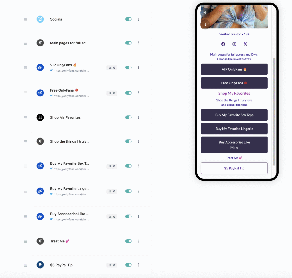
(Screenshot of the GetMy.Link interface showing a fully structured biolink page on the left (with clearly separated sections for easy navigation), and the block editor panel on the right (where blocks can be easily moved, reordered, and edited in real time.)
Test, Tweak, Repeat (Your Page Isn’t “Set and Forget”)
Most fans discover your link-in-bio from their phone – which means mobile layout is everything. Even a great page can flop if buttons are too small, too close together, or hard to read on a small screen.
Before publishing your page:
- Preview it on your phone
- Check if all links are tappable
- See how far users have to scroll
- Remove anything that feels “extra”
A good rule: if a link doesn’t get clicks – move it down or remove it. GetMy.Link gives you basic analytics so you can track which buttons are working and which ones just take up space.
Your link page should also evolve with your content. Got a new drop? Update the top button. Running a promo? Add a limited-time banner. Planning a livestream? Create a “This Week” section.
Treat your GetMy.Link like a storefront: clean it up, rotate what’s featured, and make it always feel fresh for returning fans.
Leave a Reply