Creators collect emails to keep a direct connection with their audience. Social platforms change all the time. Reach drops, links get buried, and people who were interested one day can disappear the next. An email list gives creators a way to stay in touch outside those shifting platforms and bring fans back when there is something new to share – a drop, an update, a bonus, or a special offer.
That matters even more for creators whose work depends on fan attention. Not everyone subscribes on the first click. Not everyone buys right away. Some people need a reason to come back later, and email gives creators a simple way to keep that connection alive.
A lot of people assume collecting emails requires a full website, but that is not really the hard part. What matters more is having one clear signup page, one reason for fans to leave their address, and one simple path that leads traffic there. GetMy.Link makes that possible by letting creators build a focused page without going through the full website process.
In this guide, you’ll learn how to collect emails without a website by using GetMy.Link as a simple, creator-friendly signup page.
Why You Don’t Need a Full Website to Start Collecting Emails
A full website can help later, but it is not the thing that makes email collection possible. For a basic signup flow, what really matters is much simpler. Fans need one place to land, one reason to leave their email, and one clear action to take. That can happen on a dedicated website, but it can also happen on a focused page built for that one purpose.
That difference matters because a lot of creators delay email collection for the wrong reason. They think the setup has to be bigger than it actually is. They imagine domains, hosting, design work, page builders, and extra maintenance. In reality, the first step is much smaller. The goal is not to build a whole site. The goal is to create one clean page that asks for the email in a clear way and explains what the fan gets in return.
For creators, especially those already getting traffic from social media, DMs, and link-in-bio clicks, that kind of setup is often enough. The page does not need five tabs, a blog, or a full brand site behind it. It just needs to convert attention into a contact.
That is why GetMy.Link fits this use case so well. It gives creators a lightweight page they can use as an email signup destination without making the process feel bigger than it needs to be.
Step 1: Create a Biolink Page in GetMy.Link
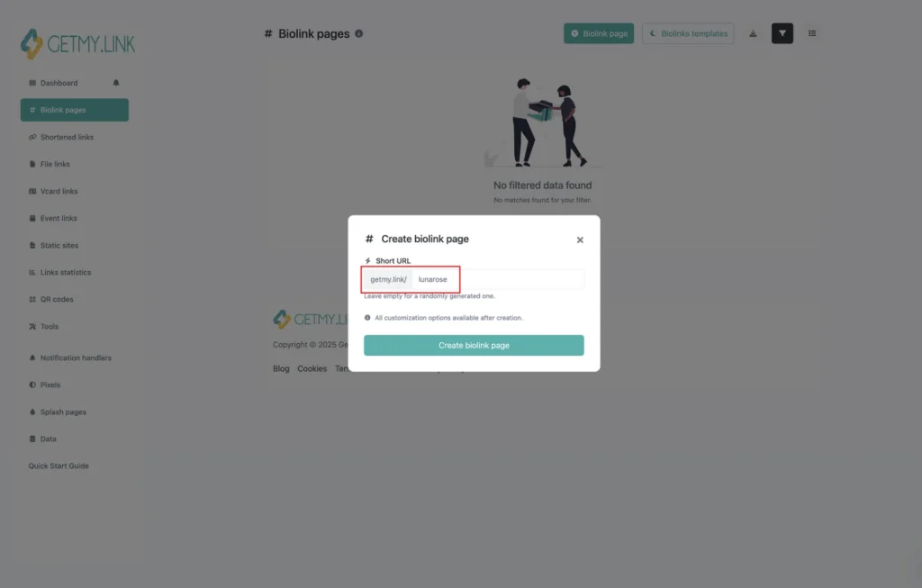
The first step is creating the page that will act as the email signup destination. GetMy.Link’s own quick start flow is simple: go to Biolink Pages, click Create biolink page, choose a short URL, and open the editor.
The full platform guide describes the same path and explains that this page becomes the place where all your important actions and blocks live.
For this article, the important mindset is not “build a full profile page”. It is “build one focused signup page”. That means the biolink page should be created with a single job in mind: collecting emails. The short URL should be easy to remember and clean enough to share across Instagram, TikTok, X, Reddit, DMs, or anywhere else traffic already comes from. A simple slug usually works better than something crowded or overly branded.
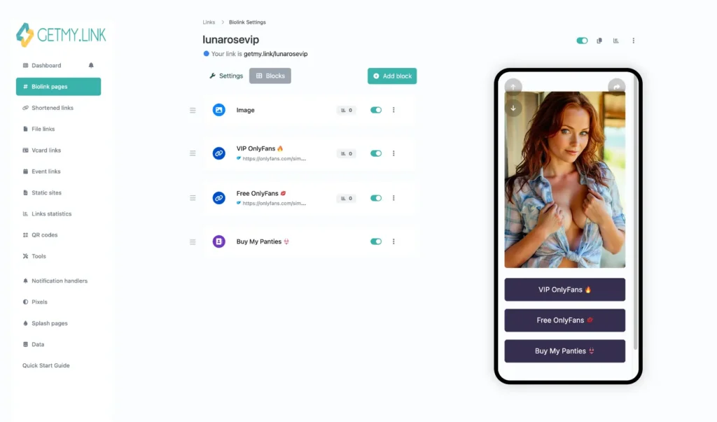
Once the page is created, the editor becomes the main workspace. This is where the signup flow starts taking shape. GetMy.Link’s guide explains that the editor is block-based, which is exactly what makes it useful for this kind of setup.
The creator does not need a website builder or separate hosting. The email page can be built inside the same system that already handles link sharing and traffic routing.
That is the real purpose of this first step. It is not just opening a page. It is creating a lightweight landing page that can replace the need for a full website in the early stage of email collection.
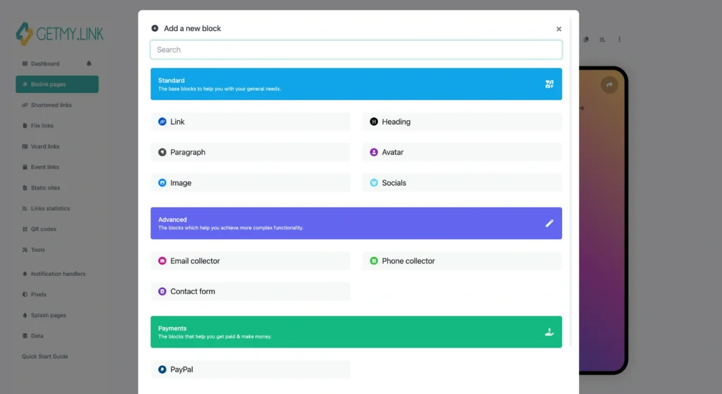
Step 2: Add an Email Collector Block
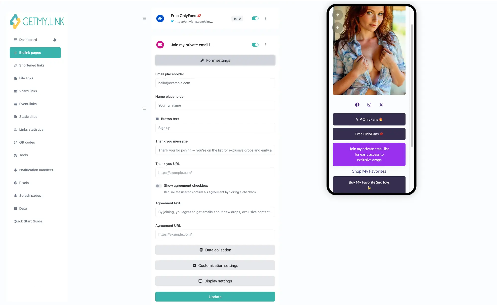
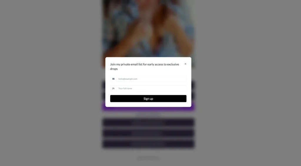
Once the biolink page is ready, the next step is adding the part that actually captures the email. In GetMy.Link, that means placing an Email collector block on the page and treating it like the main action, not like a small extra hidden between other links.
This matters because the page has one job. It is not supposed to act like a full creator hub with ten different paths. It is supposed to collect emails. The signup block should be placed high on the page so fans see it right away, ideally before they need to scroll. The closer it is to the top, the easier it is for the visitor to understand what the page is for.
The block also works better when the surrounding layout supports it. A short headline above it, a simple sentence below it, and one clear reason to sign up are usually enough. The goal is not to make the page look busy. The goal is to make the action feel obvious.
For creators, this is the point where GetMy.Link starts replacing the need for a website. The email form is already built into the page setup, so there is no need to embed a separate tool or send fans somewhere else just to leave their address. Everything can happen in one place, which keeps the process cleaner and makes the page easier to manage.
Step 3: Build a Simple Signup Page Around That Form
Once the Email collector block is in place, the rest of the page should support that one action. This is where a lot of creators make the page harder than it needs to be. They add too many links, too many buttons, or too many different directions for the visitor to take. That weakens the signup flow because the page stops feeling like a signup page and starts feeling like a general bio hub again.
A better approach is to keep the layout simple. Put a short headline near the top. Add one small line that explains what the fan gets by signing up. Then let the email block do the rest of the work. A teaser image, a preview line, or a quick visual can help, but only if it supports the same goal. Everything on the page should answer the same question: why should this person leave their email here?
This is especially important for creators because attention is short. A fan coming from Instagram, TikTok, X, or a DM is usually making a fast decision. The page needs to feel clear in the first few seconds. The more obvious the value is, the easier it is for the fan to act.
That is why this page should feel closer to a mini landing page than a traditional creator hub. It is not there to show everything. It is there to collect the email.
Step 4: Give Fans a Real Reason to Sign Up
The page can look clean and the form can be easy to use, but none of that matters if there is no real reason to sign up. People do not usually give their email just because a creator asks for it. They do it when the offer feels useful, interesting, or exclusive enough to be worth the exchange.
That is why the signup reason matters so much. For creators, the best offers are usually simple and specific. A teaser pack works better than a vague promise of updates. Early access alerts work better than a generic “join my list” line. A menu preview, a bonus drop, a comeback notice, or a special content update all give fans a clearer reason to leave their address.
The key is making the benefit obvious right away. A fan should understand in a second what they are getting. The page should not make them guess. The more specific the offer feels, the stronger the signup flow becomes.
For OnlyFans creators, this can be especially useful because not every fan is ready to subscribe the first time they click. Some just want to stay in the loop until the right offer appears. Email gives creators a way to keep that connection instead of losing the person after one visit.
Step 5: Drive Traffic to Your Signup Page With Short Links
The signup page only works if people actually reach it. That sounds obvious, but it is where a lot of creators get stuck. They build the page, add the form, choose the offer, and then forget that the whole system still depends on traffic. Fans need an easy way to find the page from the places where they already follow, click, and browse.
That is where short links become useful. A clean short link is easier to place in a bio, easier to reuse in posts, and easier to share in DMs or pinned content. It also feels more intentional than dropping a long, messy URL into every profile and caption. The page starts looking like part of a real creator funnel instead of a random extra step.
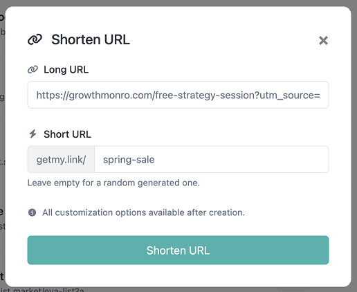
This matters even more when traffic comes from more than one place. A creator may mention the signup page on Instagram, place it in X posts, drop it into Reddit comments, or send it directly through messages. The easier that link is to recognize and share, the more likely fans are to click.
For OnlyFans creators, this is what turns the email page into something usable in everyday promotion. It stops being a hidden tool and becomes part of the main traffic flow. The signup page is only valuable once it is connected to the places where fan attention already lives.
Step 6: Keep the Page Clean, Track What Works, and Improve It
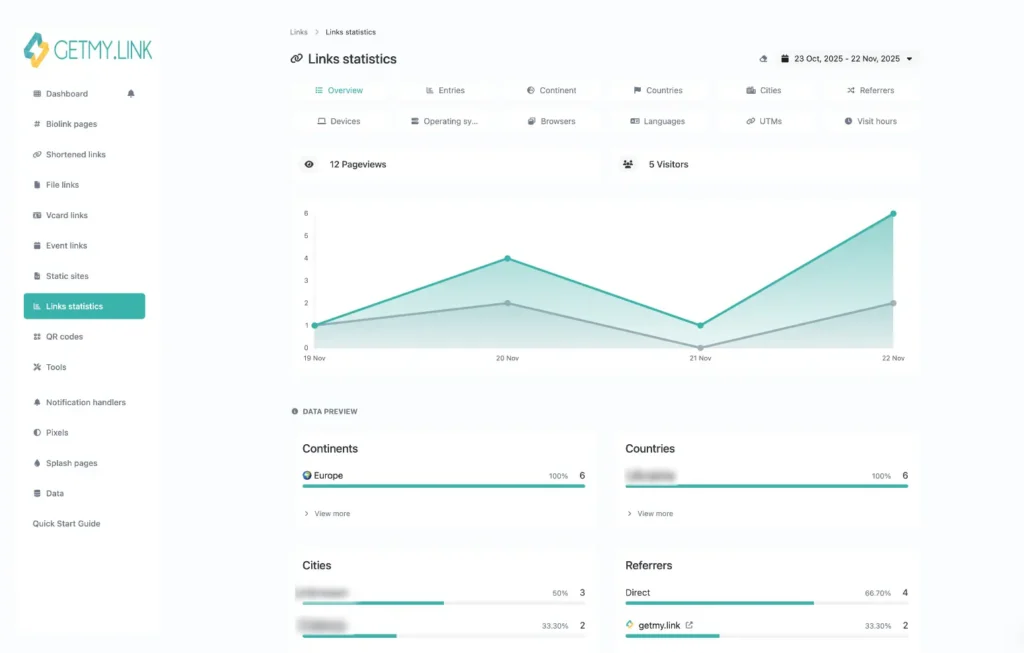
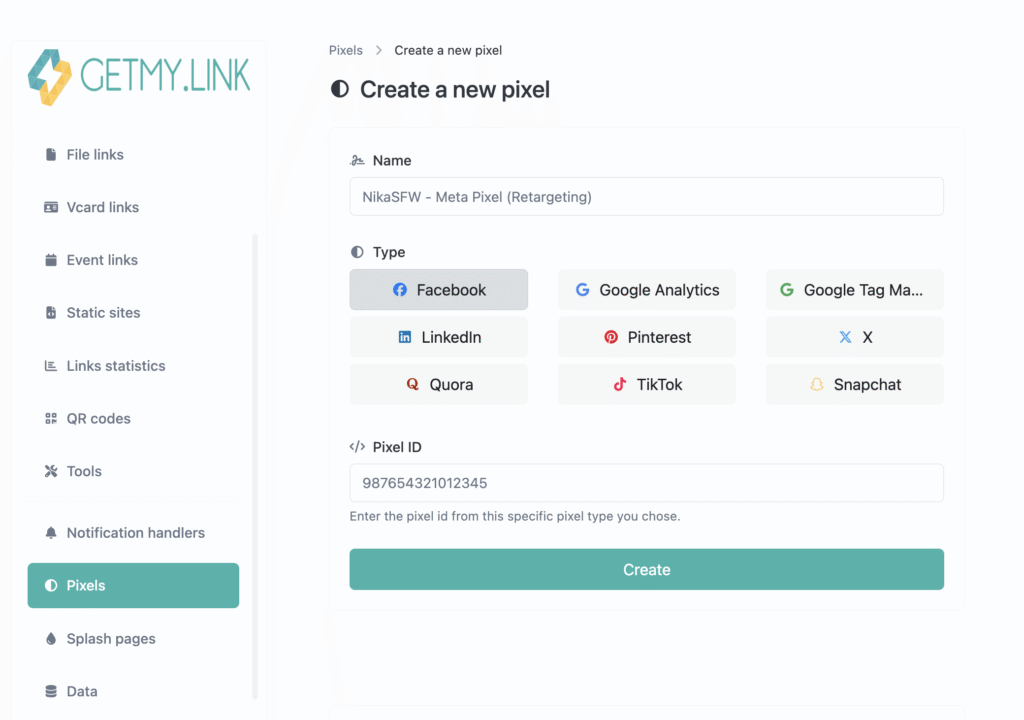
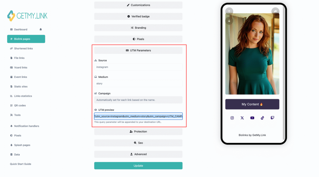
Once the signup page is live, the next part is not rebuilding it from scratch. It is watching how people use it and making small improvements over time. A signup page works better when it feels clear, focused, and built around one strong call to action. The platform also includes built-in analytics, UTM tracking, and pixel support, which makes it easier to see what people click and where they come from.
That matters because a weak signup page is not always a broken page. Sometimes it is just a page with too much on it. If fans click through but do not sign up, the issue may be the wording, the offer, or the placement of the email block. Moving the signup section higher, shortening the text, or making the benefit more obvious can improve results without changing the whole setup.
It also helps to keep the page focused on one main action. A page trying to collect emails, promote three offers, link to five platforms, and push a private channel at the same time will usually convert worse than a page with one clear purpose. The cleaner the page feels, the easier it is for the fan to decide.
That is what makes this step important. Collecting emails without a website is not only about setting up the page once. It is about treating that page like a simple conversion tool and improving it as real traffic starts moving through it.
A Simple Setup Most Creators Can Launch in One Day
A basic email capture setup does not need to be complicated. One biolink page is enough. One Email collector block is enough. One clear signup reason is enough. That is the part many creators overthink. The first version does not need to look like a full brand site. It just needs to work.
A strong starting setup can be very simple. Use one short headline that explains the offer. Add one line that tells fans what they get by signing up. Place the Email collector block near the top. Add a teaser image or a small preview if it helps support the offer. Then create one short link and place it in the traffic sources that already matter most.
That kind of setup is realistic because it matches how creators already work. The page can be built quickly, shared easily, and improved later without rebuilding everything. The hard part is not the design. The hard part is choosing one clear reason for fans to leave their email and keeping the page focused on that one action.
Conclusion
Collecting emails does not have to start with a full website. For most creators, it starts with one focused page, one clear reason to sign up, and one easy path that brings traffic there. That is what makes GetMy.Link useful for this job. It turns a simple biolink page into a lightweight signup page that can start building an email list right away.
For creators, especially in the OnlyFans space, that matters because email creates a more direct connection than social platforms alone. It gives fans a way to stay in the loop, and it gives creators a way to reconnect with people who were interested but not ready to act yet.
The best setup is usually the simplest one. One page. One signup form. One strong reason to join. When that is done well, collecting emails without a website stops feeling complicated and starts feeling practical.